

Introduction to Plotting
In this lesson we will learn how to make beautiful plots using Plots.jl. You can find the code used in this lesson here
In Julia there are many different libraries for plotting, for example PyPlot.jl, GR.jl and Plotly.jl. Plots.jl is a wrapper around all those library and exposes a clean and simple API for plotting. You can find all the back-ends available for Plots.jl here.
Installing Plots.jl
To install the library, write the following code:
using Pkg
Pkg.add("Plots")

using Plots
The first time it will take a while to download and compile Plots. The default back-end is GR, but if you desire you can change it, you can do so with a specific function for each back-end (see the documentation). For example, if we desire to use Plotly we can call plotly() (which has a very nice interactive interface).
using Plots
plotly()
To revert back to the GR back-end, simply type
gr()
Plotting
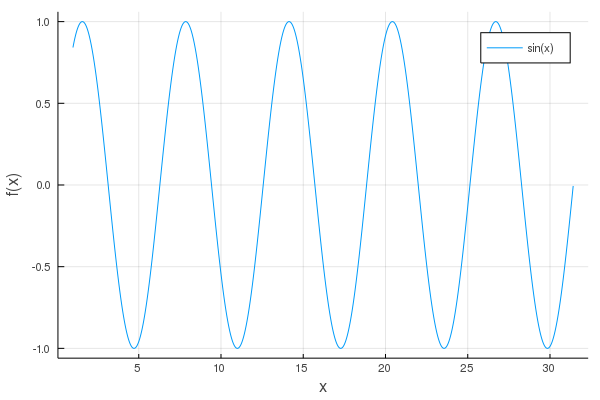
Let’s make our first plot! We need to compute x and y = f(x), for example let’s plot the sine function:
using Plots

x = 1:0.01:10*π
y = sin.(x)

plot(x, y, label="sin(x)")
plot!(xlab="x", ylab="f(x)")
On line 3 we define x (a range from 1 to 10π with step 0.01) and at line 4 we compute y = sin.(x). I want to remind you that the .(x) notation is called broadcasting and it is used to indicate to Julia that the function sin has to be computed for each element of x.
Line 6 is where all the magic happens: we plot x and y=f(x) and we assign a label to this plot, i.e.sin(x). At line 7 we add some elements to the plot, using plot!. Remember that in Julia the ! is appended to the name of functions which perform some modification: in this case plot! modifies the current plot. In particular, we add a label to the x-axis and the y-axis.
If you are using the REPL a windows should popup, on the contrary if you are using the Juno IDE a plot like the following should appear in the Plot window:
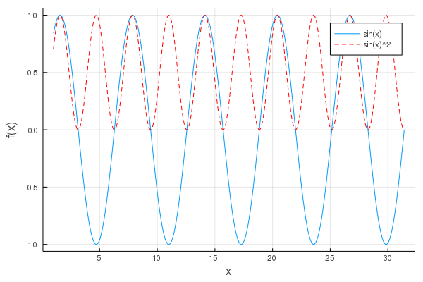
Let’s add another curve to the plot:
y2=sin.(x).^2
plot!(x, y2, label="sin(x)^2", color=:red, line=:dash)
On line 2 you can see that we have specified the colour of the line and the linestyle (which is dashed in this case). You can find more information on the possible parameters at the official documentation.
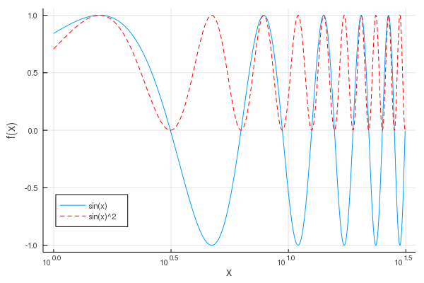
Now we can set the scale of the x-axis to be logarithmic and change the position of the legend, if we like:
xaxis!(:log10)
plot!(legend=:bottomleft)

savefig("img1c.png")
Furthermore on line 4 we can see how it is possible to save the current plot as a .png file.
Working with different back-ends
Different back-ends have different features. Up to now we have worked with GR, which is fast and has almost everything you may need. Since GR is a relatively new back-end, you may need to look at other back-ends for more customisation options. In this section, we will deal with Plotly and PyPlot.
Plotly
Plotly is a good solution if you want to have nice interactive plots.
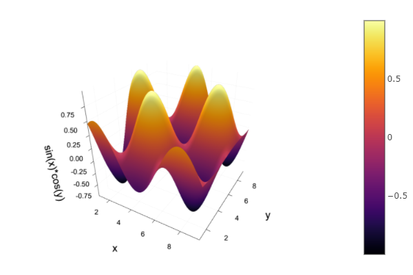
To make a plot with Plotly, select the plotly() back-end and create a plot:
plotly()
x=1:0.1:3*π
y=1:0.1:3*π

xx = reshape([xi for xi in x for yj in y],  length(y), length(x))
yy = reshape([yj for xi in x for yj in y],  length(y), length(x))
zz = sin.(xx).*cos.(yy)
plot3d(xx,yy,zz, label=:none, st = :surface)
plot!(xlab="x", ylab="y", zlab="sin(x)*cos(y)")
savefig("img2")
In this case the figure will be interactive and the saved figure will be an html page. Since Plotly is web-based it is possible to embed interactive plots in your website like the previous one:
This online interactive plot is obtained through the following code:
<iframe width="100%" height="450px" frameborder="0" scrolling="no" src="/assets/images/2019/12/24b/img2.html"></iframe>
If you want to save a plot made with Plotly as an image, you need to install the ORCA package:
Pkg.add("ORCA")
using ORCA

savefig("img2.png")
PyPlot
PyPlot is a Python library for plotting. It has many customisation capabilities with the downside that you need to first install python and configure Julia to interact with Python. In order to configure and install PyCall, the package required to interact with Python, please refer to this guide.
In order to use the PyCall back-end, please type the following code:
using Pkg
Pkg.add("PyPlot")
using Plots
pyplot()
x=0:0.1:2*π
y=sin.(x).^2
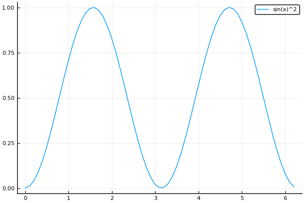
plot(x, y, label="sin(x)^2")
savefig("img3.png")
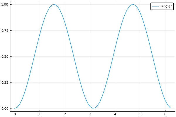
With the PyPlot back-end it is possible to use LaTeX in the labels (and axis labels) adding the LaTeXStrings package:
Pkg.add("LaTeXStrings")
using LaTeXStrings

plot(x, y, label=L"$\sin(x)^2$")
savefig("img3b.png")
To create a LaTeX string, we have to write L before the string and put the LaTeX code inside $, as shown at line 4.
You can find more about matplotlib here. Every function or property for matplotlib is available through PyPlot.function_name. If you are interested, take a look also to the PyPlot.jl package.
Conclusions
We have learned how to make some nice plots using three different back-ends, each one has its pros and cons. To summarise:
-
Use
GRfor fast “default” plotting. -
Use
Plotlyfor interactive plotting. -
Use
PyPlotif you need some of its customisation options.
If you liked this lesson and you would like to receive further updates on what is being published on this website, I encourage you to subscribe to the newsletter! If you have any question or suggestion, please post them in the discussion below!
Thank you for reading this lesson and see you soon on TechyTok!


Leave a comment